Design Lessons from Old Japanese Train Tickets
If you’re into digital design, inspiration can come from the most unexpected places — even from a tiny, vintage train ticket.
Old Japanese train tickets are beautifully crafted design artifacts that tell a story of efficiency, elegance, and cultural aesthetics.
Here’s a closer look at what makes them special and what digital artists can learn from their design.
All images sourced from @yota8nsx

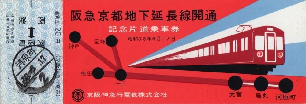
1. Thoughtful Typography
One of the first things you’ll notice about old Japanese train tickets is the impeccable use of typography. The fonts are clear, purposeful, and arranged to maximize legibility. Traditional kanji characters often sit alongside hiragana or katakana for ease of reading, creating a structured yet visually interesting layout.

Design Takeaway:
Good typography is about more than just picking a cool font. It’s about clarity, hierarchy, and balance. Whether you’re designing a UI, a website, or even a poster, consider how your text guides the viewer’s eye. Play with weight, spacing, and alignment just like these vintage tickets did so masterfully.

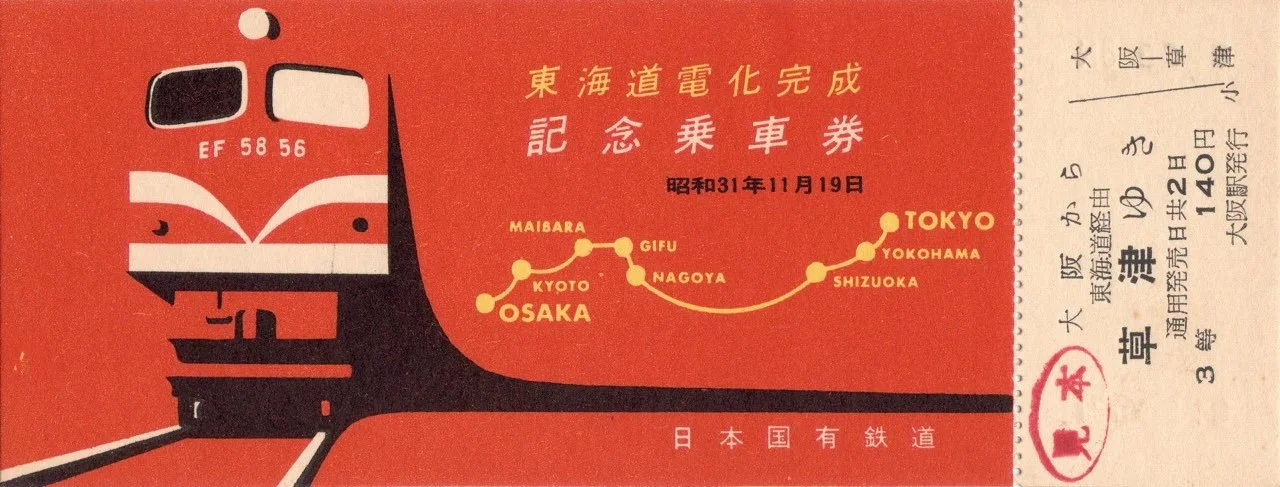
2. Efficient Use of Space
Vintage train tickets had limited real estate, but they packed in all the necessary information without feeling cluttered. Every inch was used intentionally, often employing grid-based design principles before they were even a thing in digital design.

Design Takeaway:
Working with constraints can push you to be more creative. If you’re designing for a small screen or a compact UI, think about how to structure information efficiently. Can you use spacing and alignment to make the most of your layout? Look to these tickets for a masterclass in economy of design.


3. Illustrations That Tell a Story
Many old Japanese train tickets featured beautiful, small-scale illustrations — trains chugging along scenic landscapes, iconic buildings, or landmarks representing different regions. These weren’t just decorative; they helped create an emotional connection, reminding passengers of their journey and adding a sense of place.

Design Takeaway:
Illustrations can do more than just embellish a design; they can enhance storytelling. If you’re working on an interface, poster, or packaging, consider how small visual elements can create a stronger emotional impact. Thoughtful imagery can make a design feel more personal and memorable.

4. Material & Texture
Old Japanese train tickets were not only visually appealing but they felt good in your hands. Many were printed on textured washi paper or thick cardstock, sometimes with embossed stamps that gave them an almost handcrafted feel. The tactile quality added an extra layer of engagement.
Design Takeaway:
While texture might not always apply to digital work, it becomes crucial if you’re printing your illustrations. Paper choice, embossing, or subtle grain effects can elevate a printed piece, making it feel more artisanal. Even in digital formats, you can use texture to create a sense of depth through shading, gradients, or layered elements.

5. Color Theory
These tickets rarely relied on bold colors or flashy designs. Instead, they often featured pastel tones with pops of red or blue for emphasis. The simplicity allowed the essential details to stand out.


Design Takeaway:
Minimalism doesn’t mean boring. It means knowing when to let elements breathe and when to use color strategically. A well-placed highlight can guide attention better than a cluttered layout. Refer to A Dictionary Of Color Combinations by Sanzo Wada for inspiration.

6. A Historical Perspective
Japanese train tickets evolved over decades, but the core principles remained consistent — clarity, usability, and aesthetic balance. Even as the world went digital, many of these design elements still influence modern transit cards and digital interfaces today.

Design Takeaway:
Timeless design principles like legibility, hierarchy, and balance never go out of style. Trends change, but the fundamentals remain. Study older designs like these tickets, and you’ll gain insights that can elevate your work beyond passing trends.

Old Japanese train tickets might not be the first thing that comes to mind when you think of design inspiration, but they embody a blend of history, function, and beauty that’s hard to ignore. As a digital artist, looking at physical objects like these can open up new ways of thinking about layout, typography, and user experience.


So next time you’re hunting for inspiration, don’t just scroll through Pinterest. Dig into history, touch old paper, analyze forgotten designs. You never know what hidden gems you’ll uncover.


We share works by digital artists as well as digital arts exhibitions, events, and open calls daily on Instagram — follow us for more and subscribe to our newsletter so you don’t miss new blog posts.